 Using colour is a great way to pull a room together. Even the most disconnected and bland space can feel livelier and more coordinated simply through the use of colour. But it can sometimes feel a bit intimidating to figure out how to add those finishing touches or coordinate things so that a room feels ‘homey’ and no longer like a spiritless furniture showroom!
Here I’ll show you how to use colour to coordinate a room so that your space is not only full of style and personality, but cohesion and harmony, too.
#1 Choose Your Base Palette – Warm or Cool?
Your base palette is the backdrop to the colours in your space – like the background of a painting. Your base palette is comprised of the largest surfaces in your room like your walls, seating and other pieces of furniture. The simplest choice you can make is between a ‘cool’ colour palette (whites and greys, for example)…

…or ‘warm’ colour palette (beiges and browns).

By choosing your base palette, you are already well on your way to making the room feel coordinated and pulled together well before choosing the other colours in the space.
#2 Choose Your ‘Layering’ Palette
The ‘layering’ palette refers to the layer of colour that you add to the base palette. This can be achieved through accessories, such as books, trays, pillows and throws, and the odd piece of furniture here and there. Your layering palette can consist of one colour, two colours, three colours or more, depending on your comfort level with colour coordination.
One Colour Decorating
If you feel daunted with the prospect of choosing your layering colours, start with just one. For the first while in our home, I used green as our layering colour in the Great Room.

But since one colour can be a bit boring, I created interest throughout the space by choosing a wide variety of greens from soft, ‘barely there’ sage greens in our kitchen backsplash and blinds,


to earthy greens in our artwork (plus I happen to love landscapes 🙂 )

to cheerier citron and apple greens in the faux plants in the kitchen, and pillows and throws in the seating area. I even went onto add teal and turquoise throughout the rest of the space which really livened things up!


Using greens in varying hues provided the room with visual interest and a real punch of personality throughout.
Odd Number Decorating
If you are more adventurous and decide to have more than one colour in your space, stylists and designers alike suggest that odd numbers of three’s or five’s are more appealing than even numbers – and for good reason. Odd numbers are better at capturing our attention. This is because our minds insist on creating order and symmetry out of things. Odd numbers simply surprise the senses and are much more memorable!
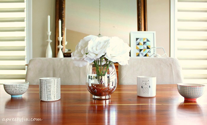
If you are new to using colours to coordinate a room, then I would suggest sticking to three complementary colours – one dominant and two secondary colours. This is where your accessories can really shine!
In my space, for example, green is the dominant colour with blues and yellows acting as the secondary ones. And like the varying shades of green in the space, the blues and yellows vary from cheerful to subtle.


(The back panels of these cubbies are interchangeable, making it easy to change the colours at any time. To learn how I did this, click here for the tutorial).

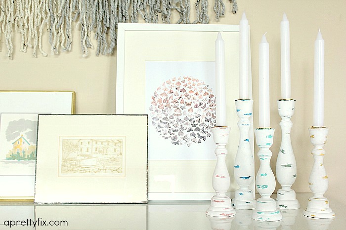

These candlesticks were a great DIY project that enabled me to add a subtle hit of all of my coordinating colours in one collection. (Click here for the full tutorial).
Final Tips:
The Rule of 3’s
Repetition is a valuable way to reinforce cohesion in any room. For this reason, there should be at least three accessories for each of your coordinating colours throughout your space. If you only have one of each colour, you run the risk of the room feeling disjointed and not quite pulled together.
Spread the Love
Spread your colours throughout the space. This may seem obvious, but it is worth emphasizing. This is key to ensuring the entire room fits together. If you concentrate your colours only in one area, like on the coffee table or sofa, for example, it will disconnect the space visually. But by spreading your colours, the entire room will feel pulled together and coordinated.
Vary Materials
To make your space visually interesting, use different textures and materials that contain your coordinating colours. These can be both soft furnishings (e.g., pillows, throws, rugs) and hard pieces (e.g., books and magazines, trays, candles and candlesticks, coasters, baskets, and side tables). By varying your accessories, your eyes will naturally want to move about the space, adding to the visual appeal of the room. And varying your materials will only reinforce the cohesion that you’ve created.

Using colour to coordinate a room need not be daunting. The recipe?: Start with just one, spread the love, and add more as required 😉


Leave a Reply